Infection and death information
Tableau Public VizSummary:
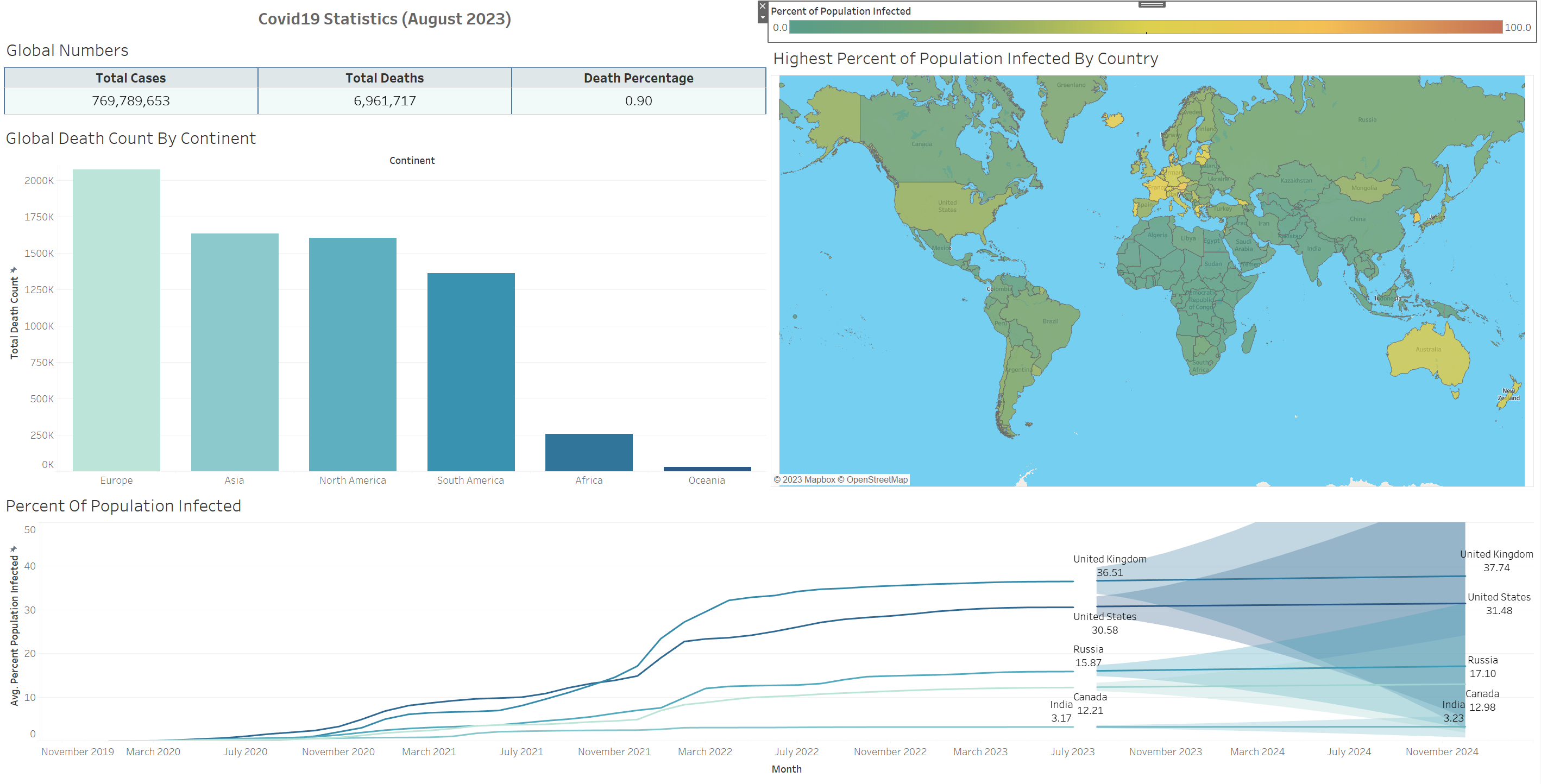
This is the visualization of my exploration into Covid infections and deaths data. It consists of a table, a bar graph, an interactive heat map, and a line graph with predictions. I followed the Alex the Analyst YouTube video to complete this project. In the future I plan on exploring the data further to view how different comorbidities affected a patient's outcome.
Data Source:
Our World in Data website (August 22, 2023).
Skills & Programs Used:
- Tableau
- Data Visualization